Role
User Research
Product Strategy
UI Design
Interaction Design
Tools
Figjam
Notion
Figma
Miro
Timeline
5 weeks
The Problem
Upon entering the Sunny Sky Shelter website, users are bombarded with an assortment of unorganized information, making the website frustrating to navigate. This poor information architecture prevents users from finding the information they need and completing the adoption process.
After analyzing the website further, I determined the main problems were:
The navigation bar's structure and labels make it challenging for users to know where they need to go.
The information structure and layout are disorganized and lack hierarchy, preventing user scanability and understanding of essential information.
The Solution
To solve these problems I…
restructured and relabeled the navbar so users could navigate the site more efficiently
reorganized the information displayed on each page, adding structure and typeface hierarchy, improving users' ability to find and understand essential information
Business & User frustrations
To start, I conducted a usability review of the current website that revealed the main user frustrations revolved around the confusing navigation and lack of information hierarchy.
Primary Frustration
Users are overwhelmed with massive amounts of information on each page.
Secondary Frustration
Button Labels for both actions and navigation are inconsistently labeled.
Competitor Benchmarking
I looked at several other local animal shelters, including Forgotten Dogs Rescue and Emerald City Pet Rescue. Reviewing competitors, I learned what information other shelters prioritized and how they organized information. I made note of the following features:
Navigation was more learnable for users when the navbar had one word labels that were actionable.
Competitors had some variation of an "adoption" or "donation" call-to-action toward the top of their landing page.
Information was broken up in sections and used images and icon illustrations to better communicate information and navigation.
Information Architechture
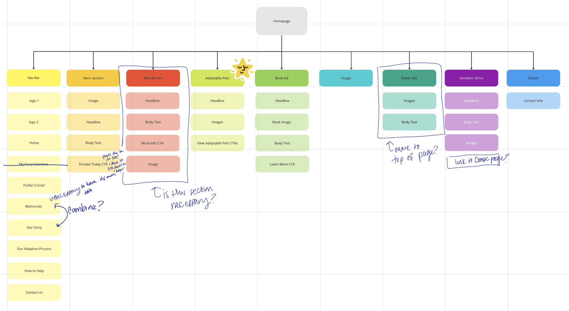
Since I had determined that the current information architecture was one of the main problems, I decided to break down the structure of each page to understand what information was essential and what was unnecessary/needed to be recategorized. This allowed me to prioritize where the major structure issues were and determine which sections needed to be relocated to improve user comprehensibility.
Problem Space
My user research concluded that the main problem with Sunny Sky's website is its lack of information architecture, which decreases the user efficiency and learnability of the website. This prevents users from confidently completing adoptions and learning how they can support the shelter.
From there, I was able to come up with the following question to focus my ideation and design:
How might I improve the information architecture of Sunny Sky's website to increase adoption and donation rates?
Ideation
After brainstorming, mind mapping, and several rounds of crazy 8s, I came up with possible solutions to how I could improve upon the website's information structure and user experience.
What can we add
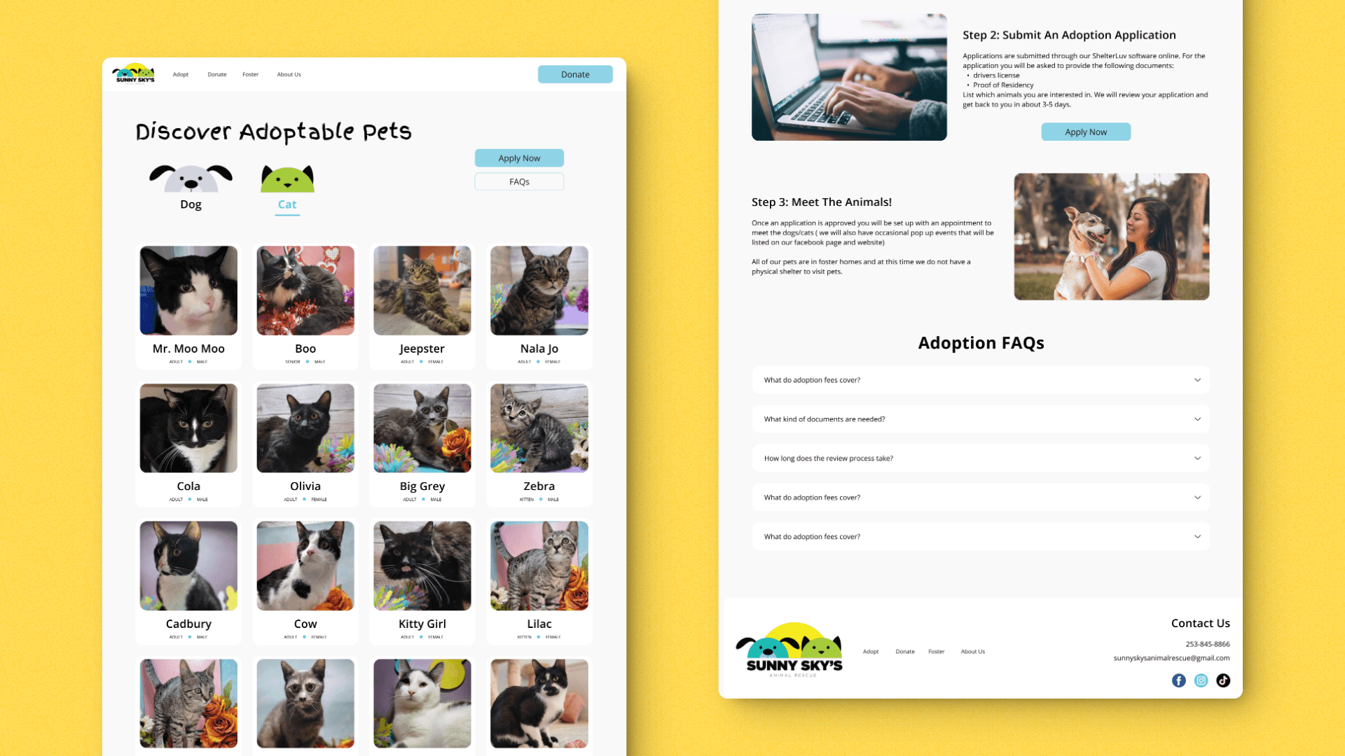
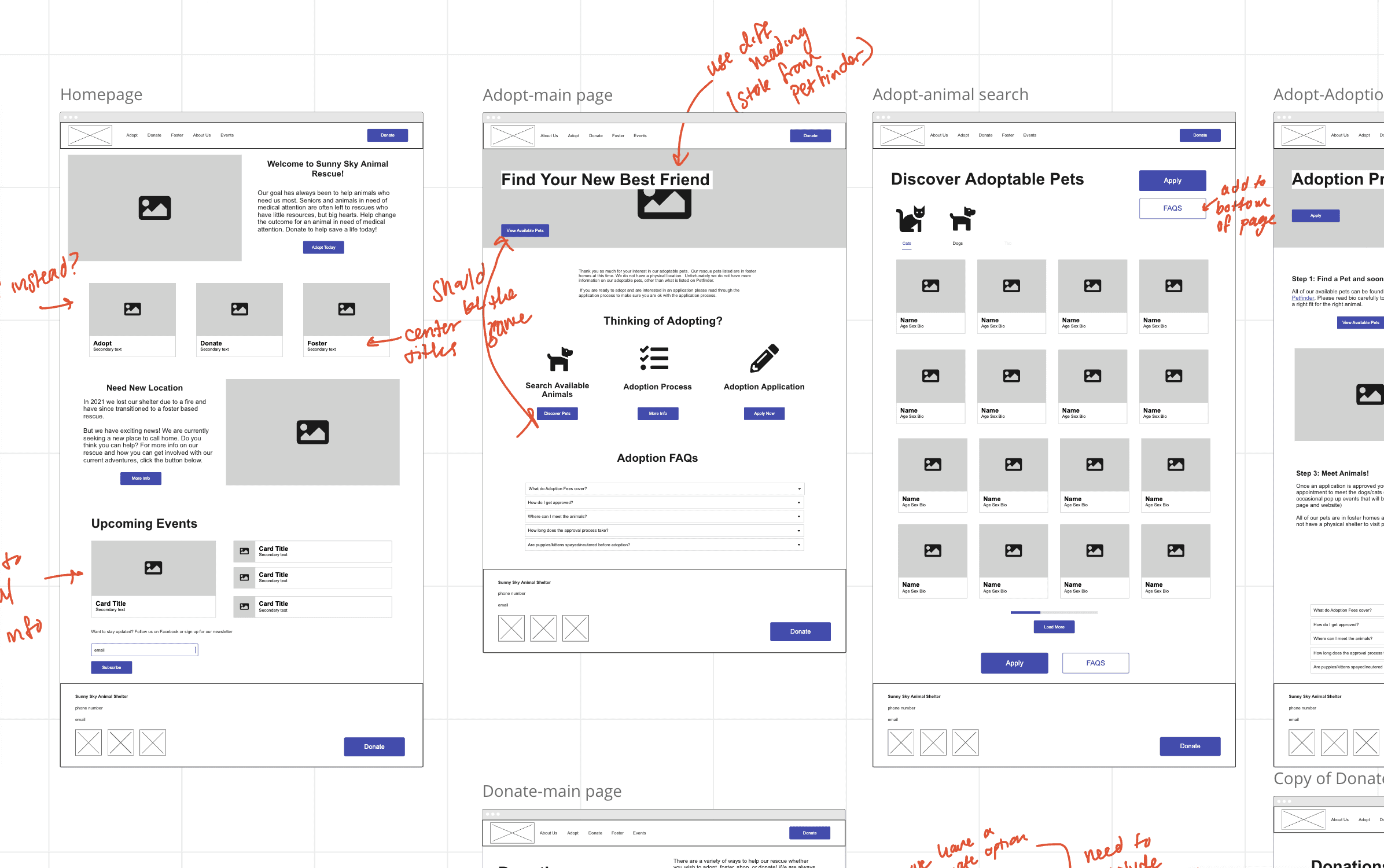
I could add FAQs to the bottom of each page so users have an easier time finding essential information.
What can we improve
I could improve the navbar by changing the navigation tab labels to one-worded actions.
Wireframes
Using Miro's wireframe library, I built out wireframes for each page of the website to map out the new layout and information structure.
Styles & Components
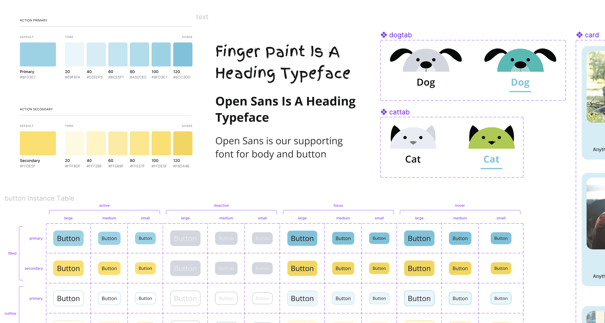
Before I started prototyping, I built a library of interactive components, colors, and text styles to maintain consistency while I worked in Figma.
Sunny Sky's original website used a lot of inconsistent typography. I decided to select a new primary typeface used for body text to ensure consistency across the entire website. I also selected a new secondary typeface to support Sunny Sky's fun, welcoming personality. I decided to use the Google font "Finger Paint" to use for accent headings.
High Fidelity Prototype
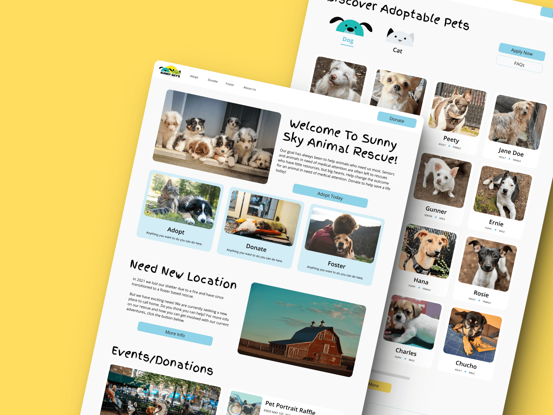
My high-fidelity prototype improves information structure and user navigability so users can find the information they need in order to be involved in the adoption and donation process.
Some improvements include:
The navbar is simplified with a single logo, universally defined tab labels, and a donation call-to-action increasing the efficiency of user navigation.
Available animals are now listed directly on the shelter's website instead of forcing users to view available animals on a third-party site.
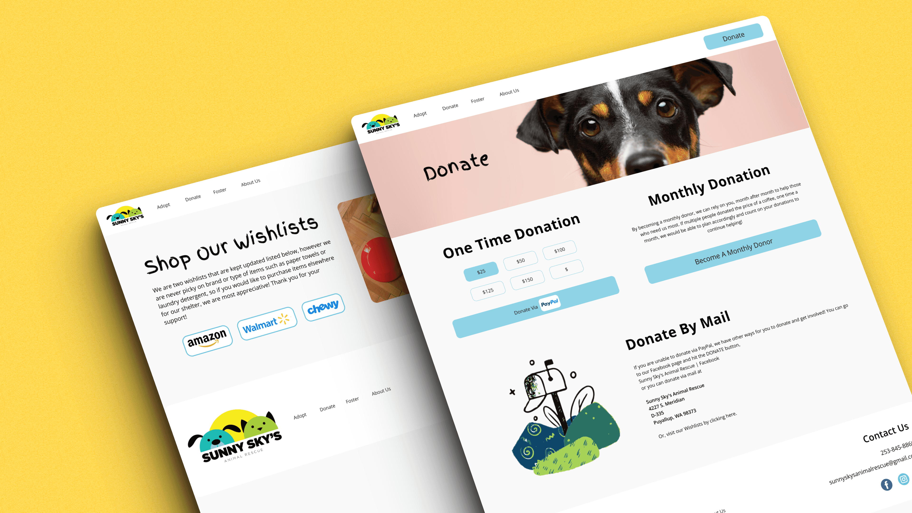
Users are given defined donation options, creating a more stream line donation process. Users can now select a desired donation amount with one click and they have the option to sign up for monthly donations, increasing the amount of donations the shelter receives.
"Happy Tail Updates" are now displayed as individual articles, allowing users to read the stories they want, in short chunks of information instead of being overwhelmed with one long page of text.
Three key learnings
1. Strong information architecture is a key part of the user experience. Without it, users can be overwhelmed and miss important information.
2. Confusing navigation and button labels can be a point of major frustration for users, causing user drop-offs. It is important to be clear and consistent with your labeling for users to understand how to navigate through your site.
3. Building wireframes before prototyping is clear in keeping your project build efficient and on-time, especially for larger projects.
Next steps
With my high-fidelity prototype complete, my next step would be to get feedback via a usability review. With user insight, I could determine the flaws in my design, which I can address in future iterations.
There is also still some detail work that needs to be completed on this project. For example, there are some repeated images and iconography. More image and iconography exploration is required to make this a final polished project.