Role
User Research
Brand Design
UI Design
Interaction Design
Tools
Figjam
Notion
Figma
Framer
Timeline
2 weeks
The Problem
Goldman Digital needed an online location where clients could quickly book a call with them. This place needed to highlight Goldman Digital's experience, professionalism, and services.
The Solution
The Solution was to…
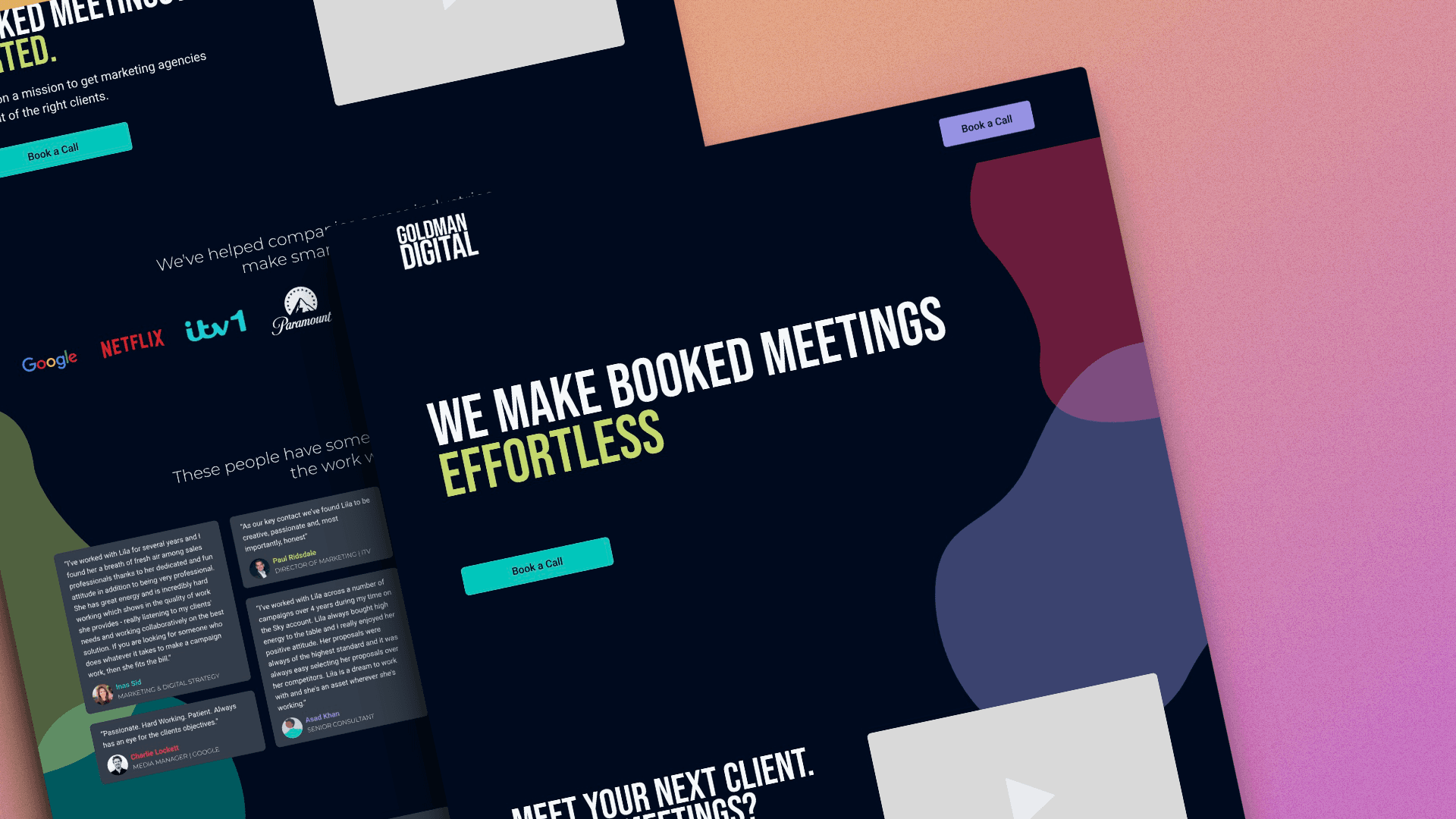
Design a responsive landing page which used a dark, bold, and simple aesthetic to clearly communicate Goldman Digital's modern professionalism.
Make all action buttons have the same function. All buttons are labeled the same ("Book a Call") and all of them take the user to Goldman Digital's Calendly link.
Competitor Benchmarking
In order to understand the industry as well as the style Goldman Digital wanted to encapsulate, I conducted some competitor benchmarking and usability reviews. I reviewed two websites; Adwhile and Contrarian Thinking. I found:
Both of their styles were bold and simple and used a dark mode design.
They displayed testimonials from previous clients in a way where users could quickly see and read testimonials from several clients.
They simplified and broke down their services, providing numbers for how their agency has benefited clients.
Ideation
With a better understanding of how Goldman Digital wanted their site to look and function, I began ideating by section. They wanted their landing page broken up into 6 sections:
Hero Banner
Introduction Video
Brand Partners
Testimonials
Services
Final Call to Action
It was important to display their content in a way that would support their experience and professionalism while fitting within their branding.
One of the trickest sections was the testimonial section.
The Problem
They wanted to display 8-10 testimonials, but wanted them to all be viewable at once (no carousel).
My Solution
I could create a grid of small cards which focused on the text with a small bio section. Now all testimonials could be viewed on the screen together while maintaining a simple and readable design. The style of cards resemble those found in social media as well which promotes Goldman Digital's modern professionalism.
Wireframes
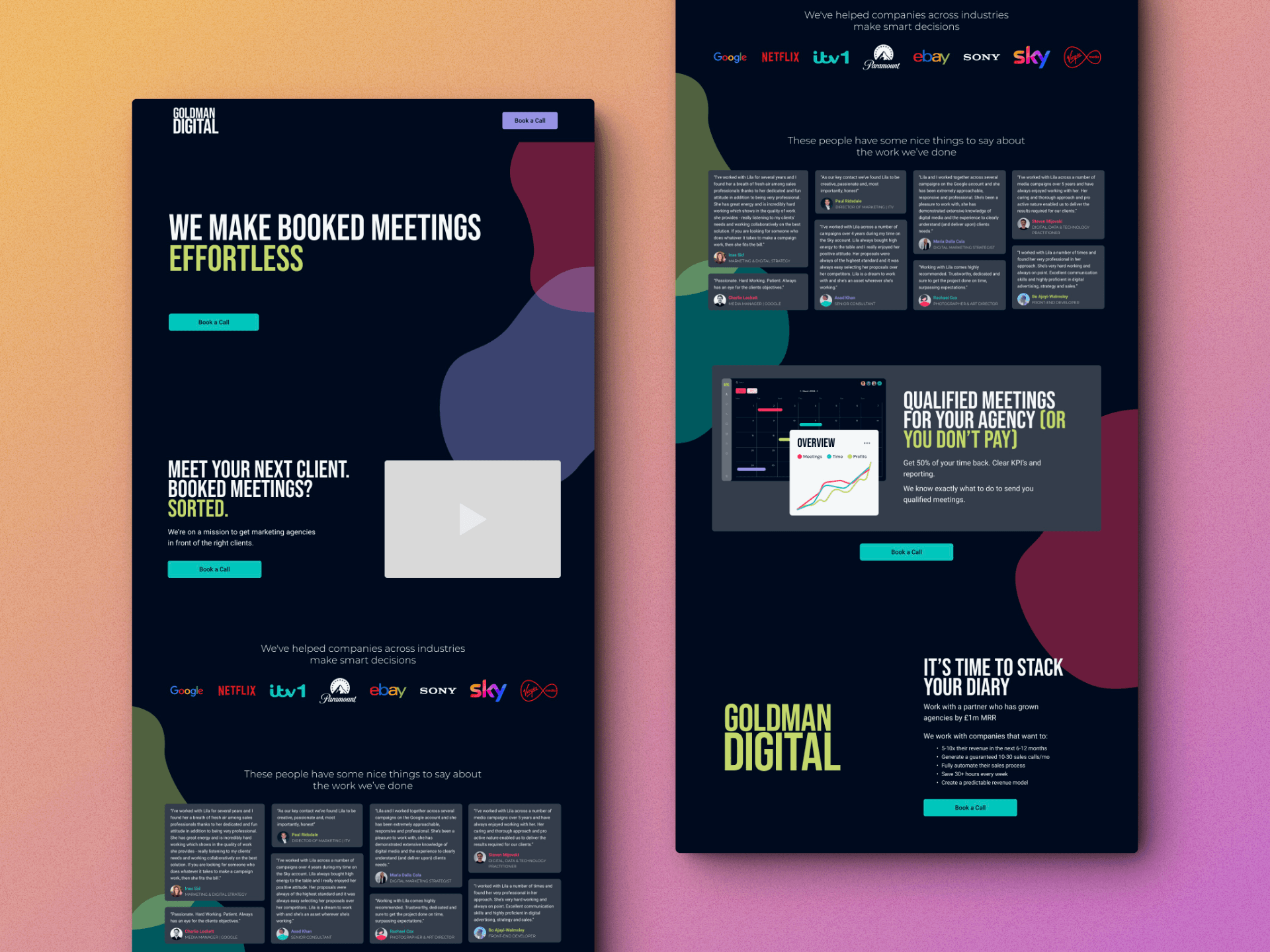
Once I knew the style and information that needed to be included, I drew up a wireframe of the landing page.
At this stage, I reconnected with my client for feedback, making sure all requested elements were presented and that she liked the direction the design was going in.
She gave me great feedback on my design, and I found out she wanted the testimonial and services sections to be presented slightly differently. Working with my client at this step was essential in preventing frustration and revisions down the line.
Styles & Components
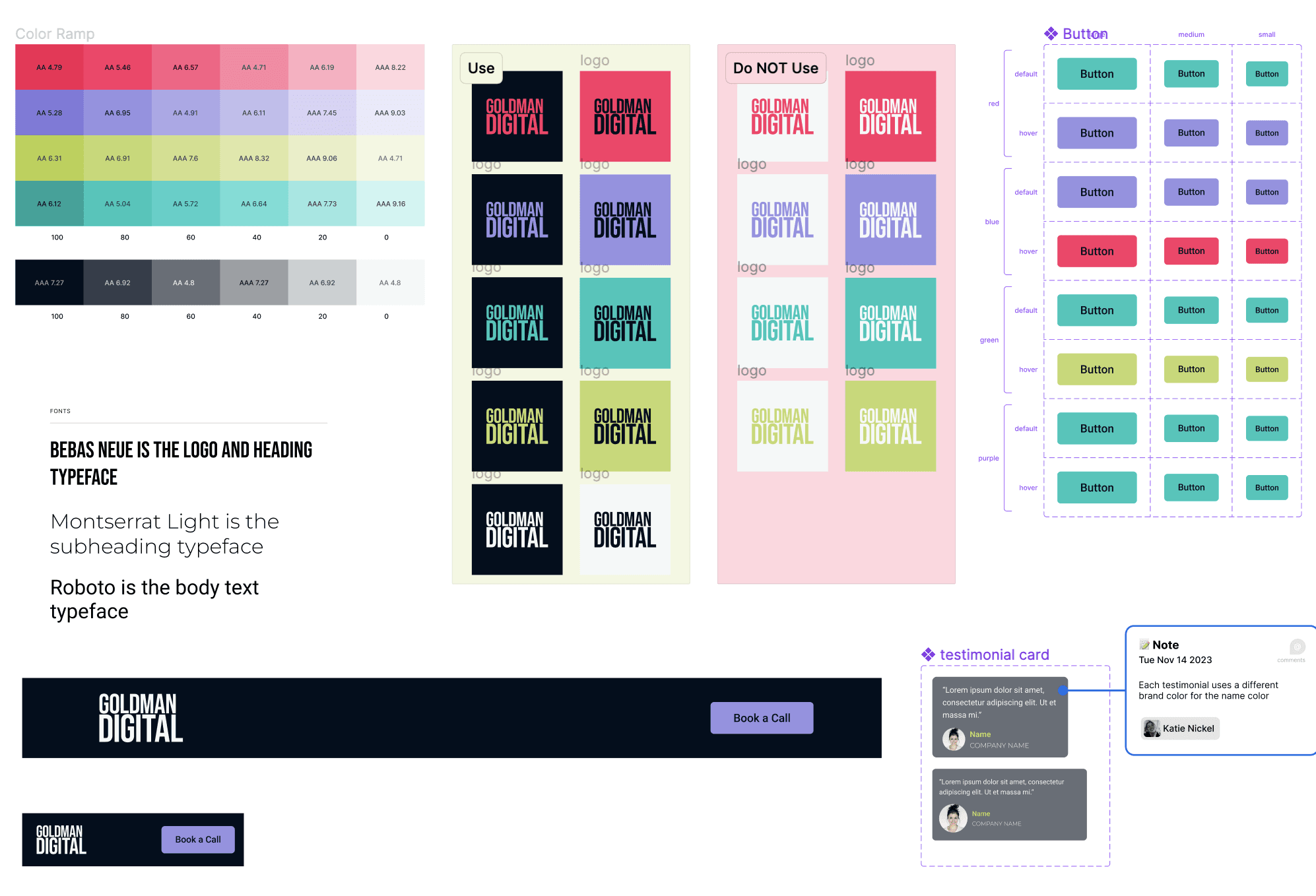
Once Goldman Digital approved of the wireframe, I built a design library of interactive components, colors, and text styles to maintain consistency while I worked in Figma.
High Fidelity Prototype
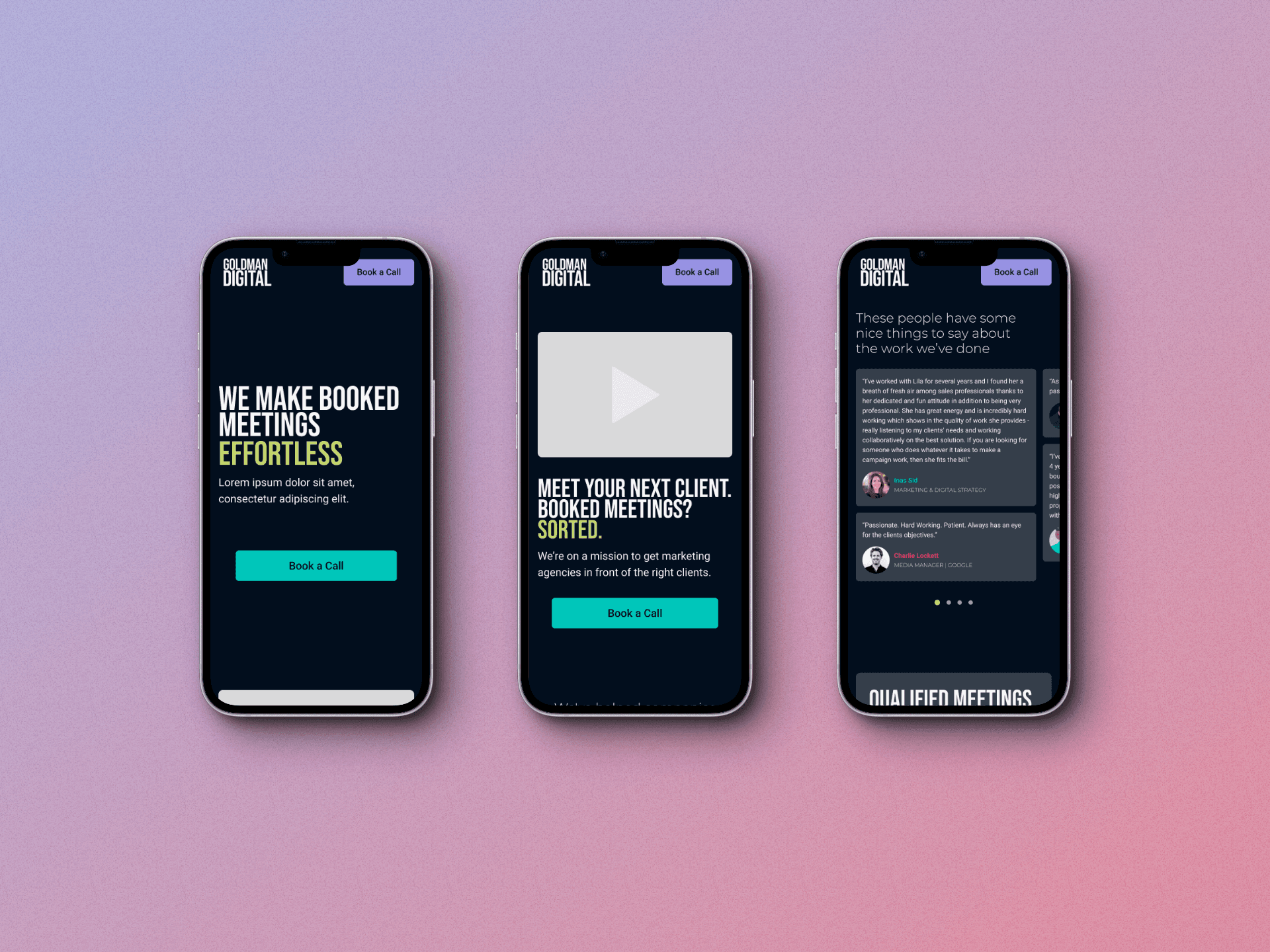
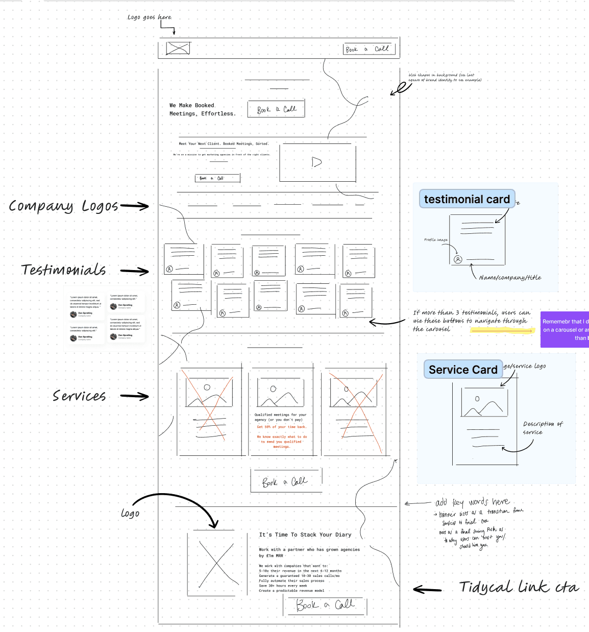
Using the design library I made, I was able to build an interactive prototype for both a mobile and desktop version of the landing page. The two versions contain all of the same elements with the biggest difference in the testimonial section.
Desktop Version
The Desktop prototype remained simple, showcasing the dark, bold, and modern brand that is Goldman Digital. The only direct interaction is the hover effect on the primary button. All buttons are labeled the same ("Book a Call") and all of them take the user to Goldman Digital's Calendly link. The sites simplicity ensures the user can easily read the content and can complete the desired action efficiently.
Mobile Version
The mobile version maintained the general layout and structure as the desktop version, with two major differences.
A continuous scroll was added to the brand partners section. This allowed for the look of the page to match the desktop while still allowing the user to see all of the brands Goldman Digital has worked with.
The testimonial section became a carousel. This allowed the grid from the desktop version to be maintained while users are able to scroll and read through all testimonials.
Development
Upon approval of the landing page, I uploaded the prototype to Framer. I developed the website through Framer so that it's function matched the interactive prototype and was then published. You can find the live site here: https://www.goldmandigital.co.uk/
Three key learnings
1. Responsive design is essential to ensure accessibility across all devices.
2. For a design to be successful, you need to maintain a friendly but professional relationship with the client in order to encourage creative collaboration and to achieve both the business and user goals.
3. Technical Learning: The creation of interactive components in Framer.
Next steps
With the landing page live, I need to monitor the page's analytics and conduct a survey with my client in order to determine if the page is successful in achieving an increased number of conversions.