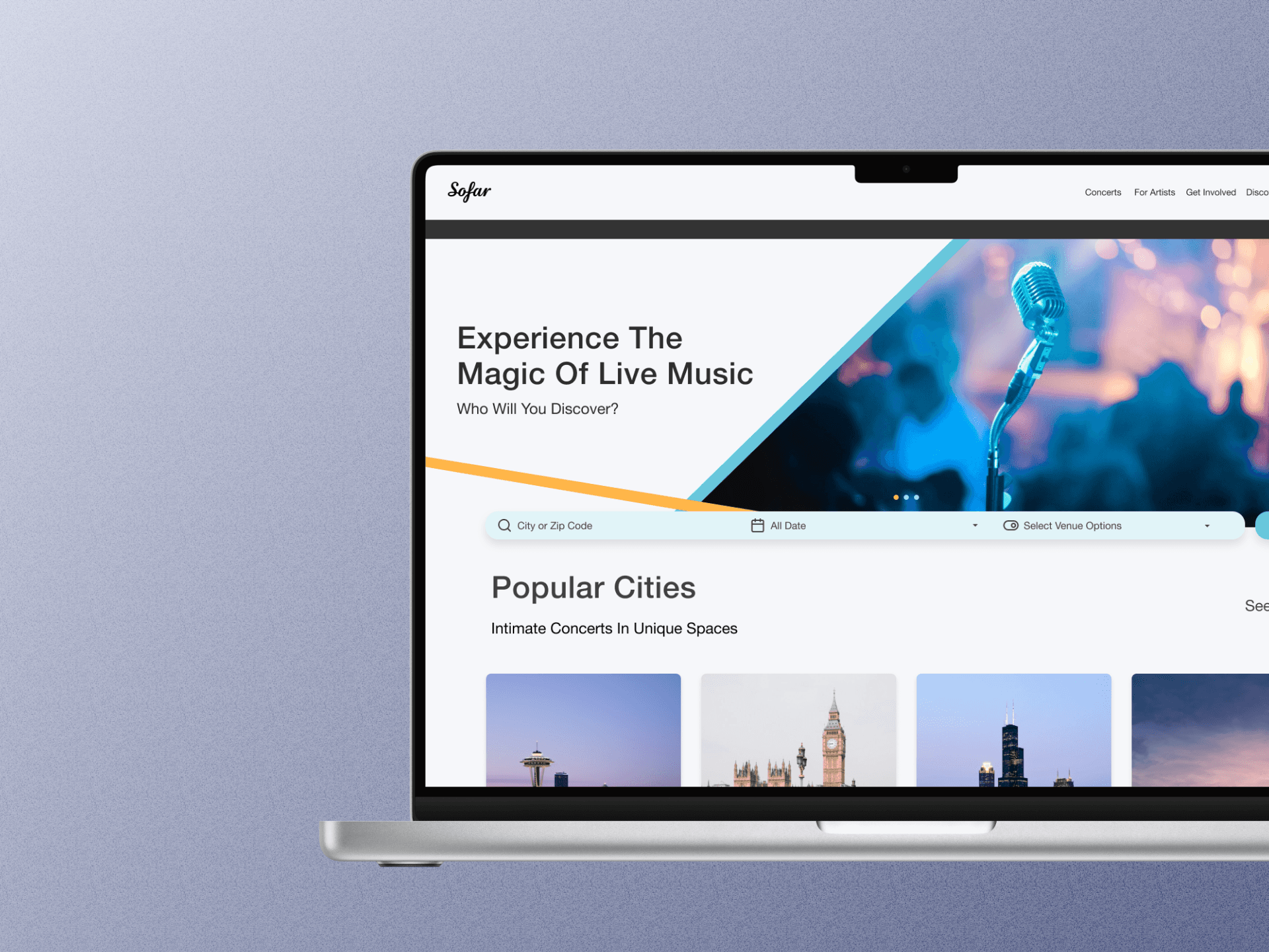
Role
User Research
Product Strategy
UI Design
Interaction Design
Usability Testing
Tools
Figjam
Notion
Maze
Figma
Otter
Dovetail
Timeline
5 weeks
The Problem
When entering the Sofar Sounds website, users are met with loud images and little direction. This makes the website hard for users to navigate, leading to less show discovery and ticket purchases.
After analyzing the website further, I determined the main problems were:
A single drop-down search bar, limiting the search to location
No clear description of what Sofar Sounds is
The Solution
To solve these problems, and provide new users with more direction when they enter the app, I…
expanded the search bar capabilities to include location, dates, and venue filters
reorganized the information hierarchy so users could learn the Sofar Sounds' business model more efficiently
Business & User frustrations
To start, I conducted a usability review that revealed the main user frustrations revolved around the limited search capabilities and lack of information hierarchy.
Primary Frustration
When new users enter the app, it is difficult to know where to start since there are two search bars that are small and hard to read (not presented as the main focus).
Secondary Frustration
As new users move through the website, they are presented with little information and icons lacking description, which leaves the users confused as to what they can expect/what they are paying for.
Competitor Benchmarking
I looked at direct competitor Ticketmaster and indirect competitor Festicket, which revealed how users find shows through other companies. I kept the following features in mind throughout my redesign:
The search bar included options for location, date, venues, and events.
Events were organized/presented by the soonest date and most popular artist/event.
User Interviews
I conducted several user interviews where I asked users how they search for shows and other behavior surrounding looking for and attending concerts.
User Insights
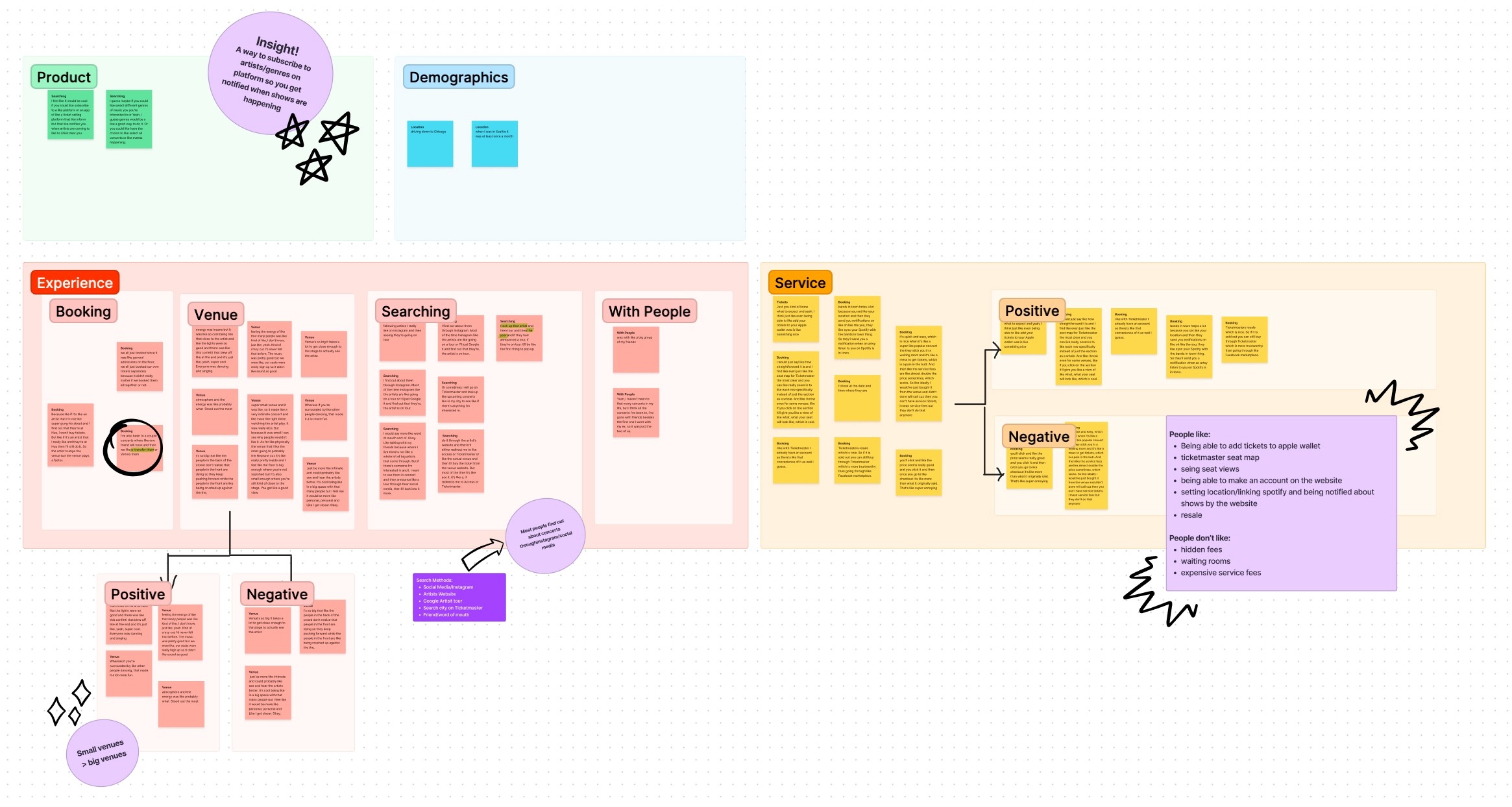
The above affinity map revealed several insights into how users prefer to search for concerts and what they consider when deciding on which shows to attend.
Primary Insight
Users usually find out about shows by following artists on social media.
Secondary Insight
Users usually decide on which shows to attend based on the artist, but they do enjoy small intimate venues, and the venue can be a factor in their decision-making.
Problem Space
The user research showed that the main problem with Sofar Sounds' website is that users need a less limiting search flow and a more direct explanation of what Sofar Sounds is upon entering the site.
From there, I was able to come up with the following question to focus my ideation and design:
How might I improve the accessibility and experience of Sofar Sounds to increase ticket sales?
Ideation
After some brainstorming and several rounds of crazy 8's, I determined how I could improve upon and add to the website's experience.
What can we add
I found I could add reviews and ratings of the venues by users.
What can we improve
I decided to improve upon the search bar; expanding it to include date and venue options.
Wireframes
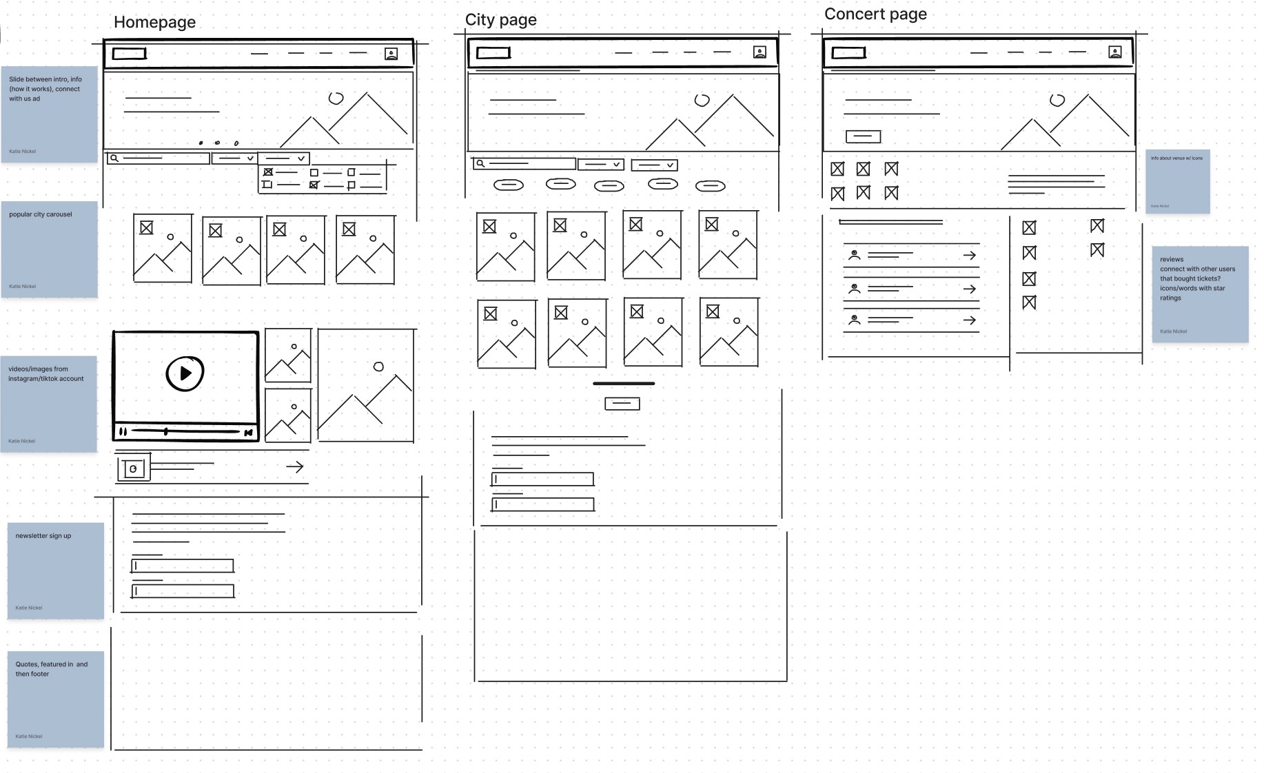
I built wireframes to show how I was going to expand the search bar and add user reviews to the venue page.
Styles & Components
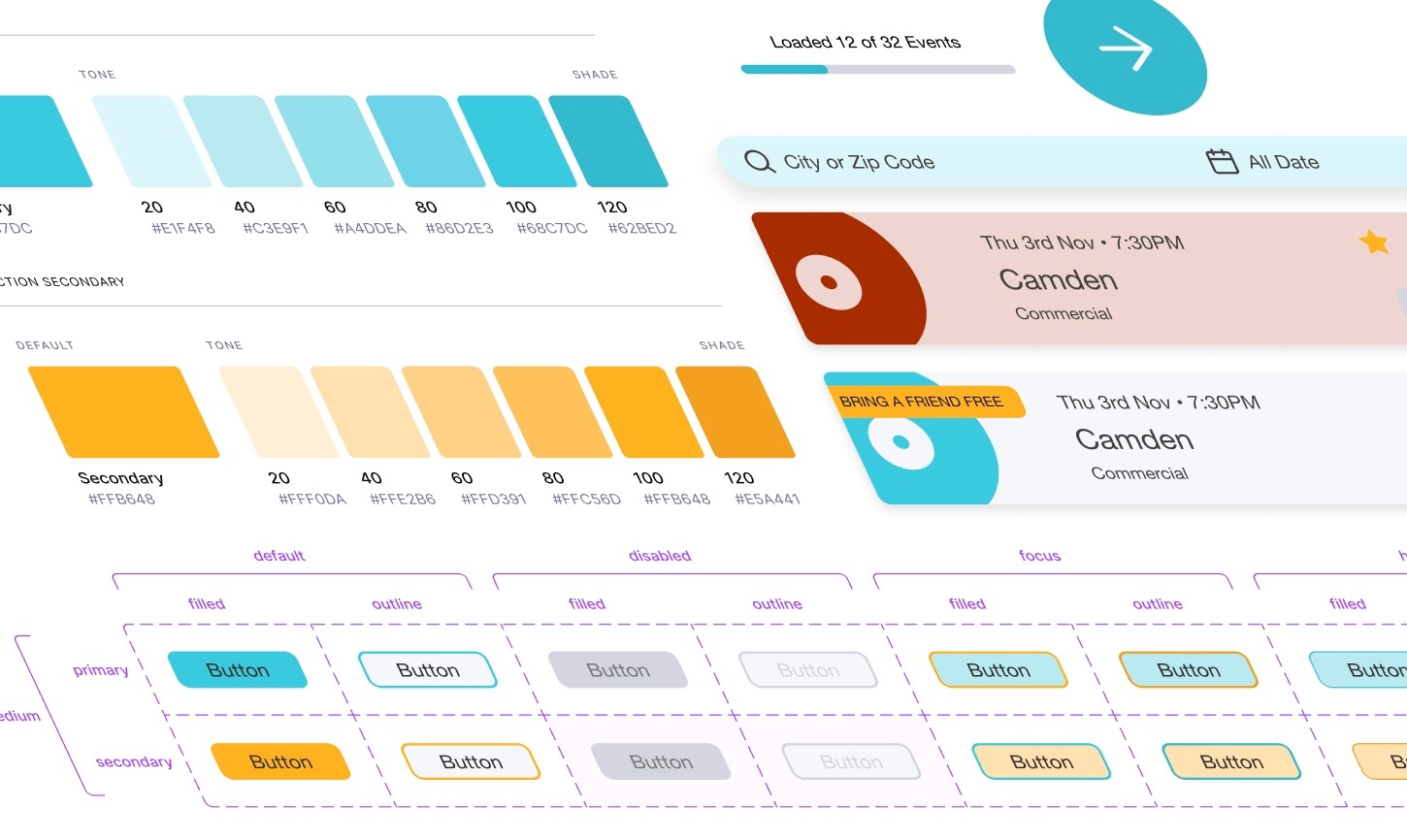
I built a library of interactive components, color and text styles to maintain consistency while prototyping.
I decided to adjust the previous neon turquoise color to a deeper, more saturated blue primary color to make the color palette softer on the eyes while still maintaining the original brand style.
I also added a yellow/orange secondary color to add happiness and optimism to the color theme.
High Fidelity Prototype
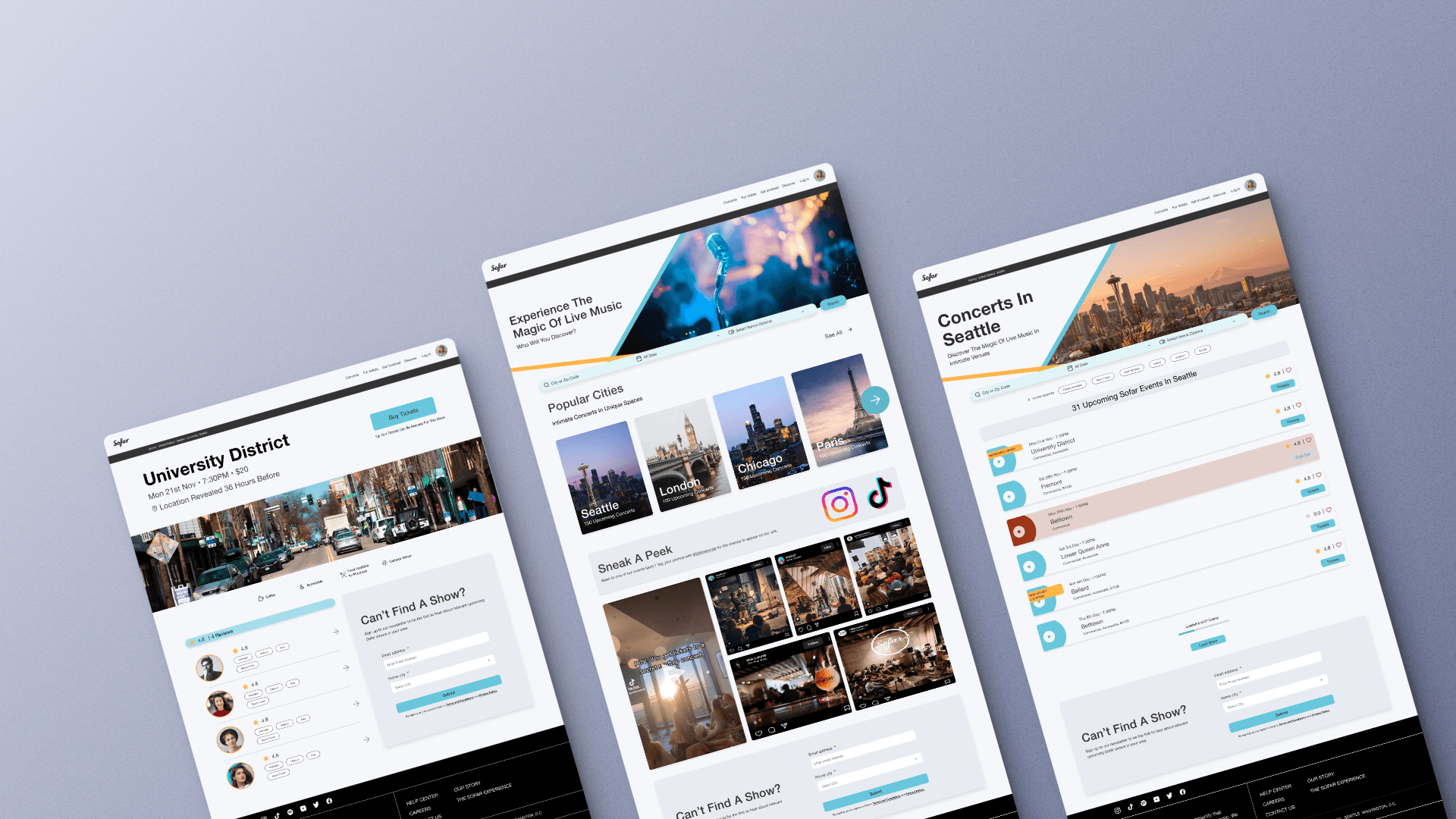
My high-fidelity prototype improves how users can search for shows, learn about and connect with the company for an improved user experience.
Some improvements include:
On the home page, there is now a large rotating banner that users can click through to learn about how Sofar Sounds operates.
A search bar where users can type in their location, pick a date, and select characteristics about the type of venue experience they want.
A section where users are encouraged to connect with Sofar Sounds on social media (since user interviews revealed that's how most people find concerts).
Users can see how other users enjoyed and rated the venue while keeping its location secret.
Three key learnings
1. Conducting user interviews beforehand is an important step that provides additional insight into current user behavior. This can drastically change how you decide on the function and design of a product.
2. The structure of the information hierarchy can improve or diminish a user's understanding of a product.
3. Spending more time on ideation improves user-centric designs and will save you time in the long run.
Next steps
With my high-fidelity prototype complete, my next step would be to get feedback via a usability review. With user insight, I could determine the flaws in my design, which I can address in future iterations.
I would also expand on my prototype, adding a screen for how users can review venues while still keeping the locations a secret.